
Had to go to the hardware store, so I decided to take my camera and walk around for a bit since I was outside already anyways.
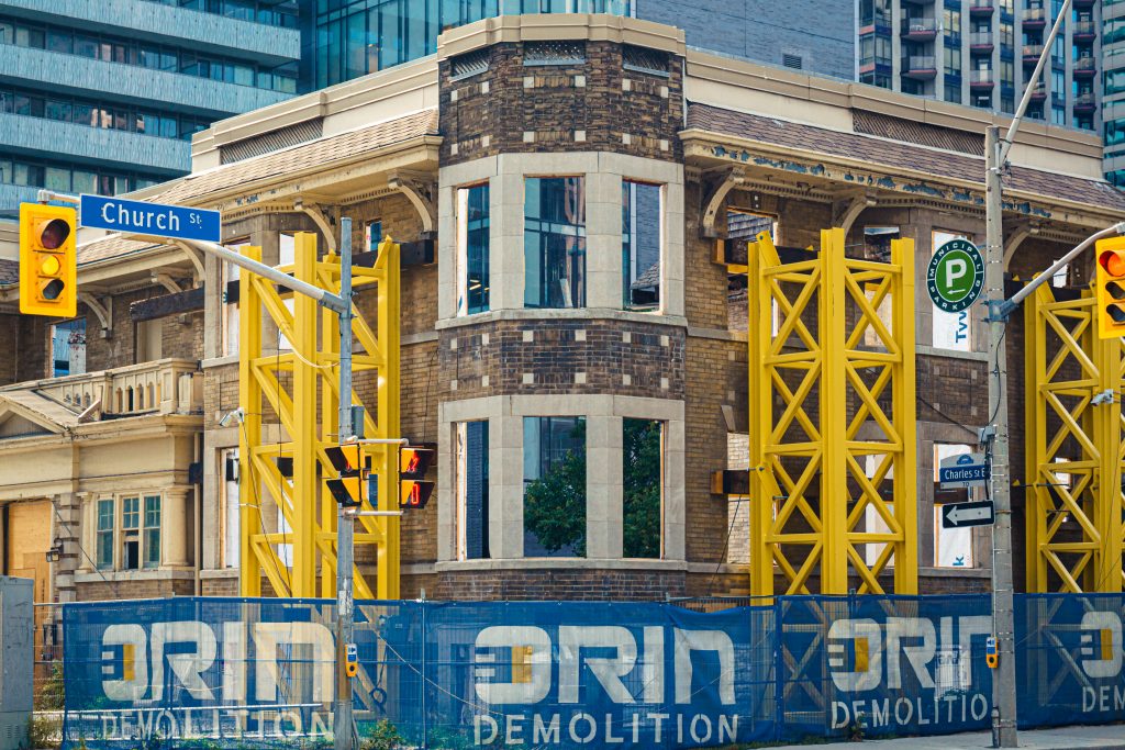
The blues and yellows in this corner really caught my eye. I also like how the saturation in the colours separates the desaturated items that were part of the “old world” (the brick façade) in contrast to the saturated modern items (scaffolding, the branded fabric, traffic lights, etc.).
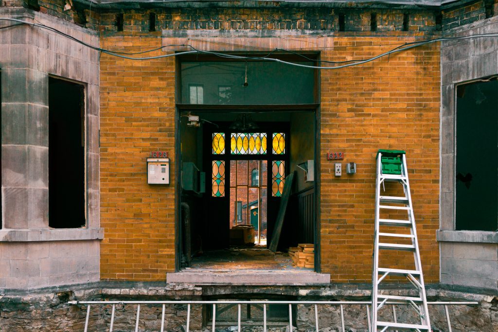
I was immediately drawn to how bright and beautiful the stained glass looked framed by the dark hallway. Thankfully, a construction worker left that ladder where the brick wall is larger because it helps me centring that motif while balancing the symmetry (without it it would’ve felt wrong to have more brick on the right than on the left). Not only that, the green square was also the perfect colour to contrast the orange tones in the brick and allowed me to colour grade the whole image around that colour combo. I’m truly happy about how this one came out.
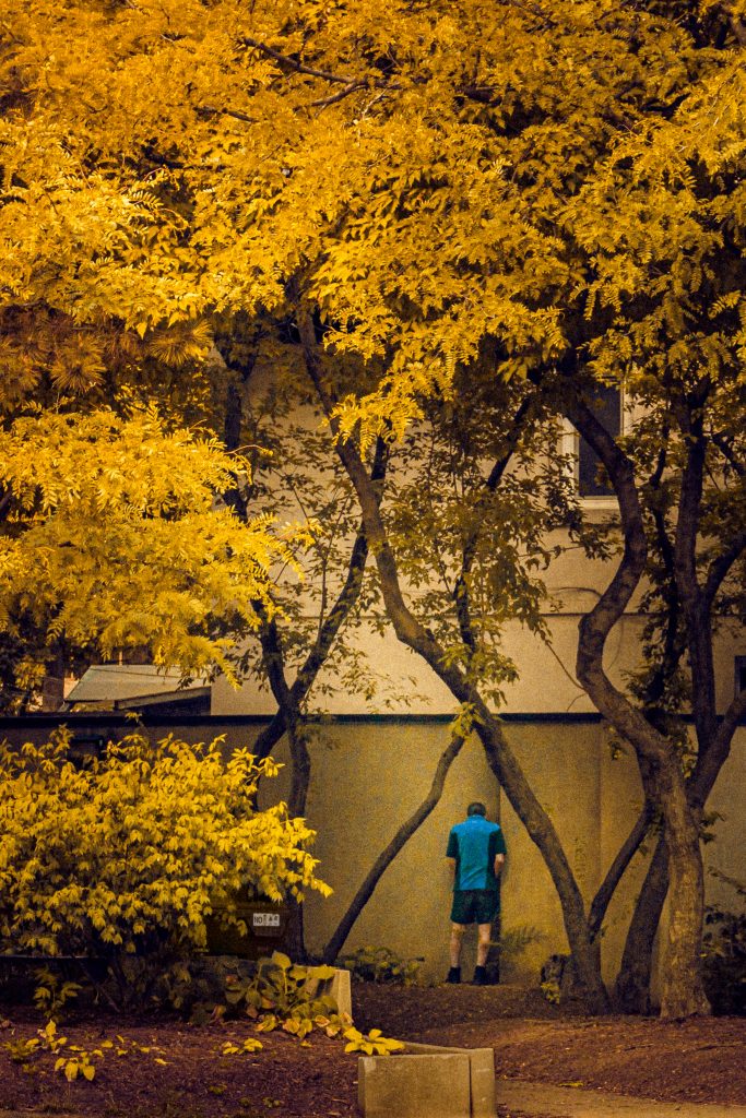
Now this one, is a great example of when the content inspires you to go bonkers in the post editing just to see what can happen…
I don’t normally take street photos focusing on people I haven’t talked to (and I don’t talk to strangers, so I normally end up focusing on architecture, flowers, “open scenes”, etc). So when I saw this guy peeing on the wall I just lifted the camera, zoomed to the max (a meagre 50mm), and snapped a quick photo of it “just because”, while worrying more about not being seen than anything else.
The first step of editing was finding the actual composition I would’ve shot if I had a larger zoom lens. Because I’m trying to familiarize myself a bit more with the dynamic composition grid, I decide to use that when cropping this image.
Where to start? Focus on the main story only: the guy peeing. The strongest diagonal in that small scene is in the tree to the right and it kinda follows the sinister diagonal, so I started by aligning it there.
I then placed the man in the triangle formed by the two bottom reciprocals and the vertical line created by where the sinister meets the bottom reciprocal. I liked that placing it there created a “framed within a frame” look between foliage and non-foliage content. I also really like how the foliage line almost mimic the diagonals.
Composition solved, I had to find a way of reorganizing the hierarchy in the image so that it told the story I wanted: as it was shot, the image was telling the story of the trees with the man as a surprising “sub-plot” within it. That in itself has its merits, but I wanted to have some fun and tell a different story.
Because he already had a great figure-ground relationship and his shirt accentuated that, it was just a matter of decreasing the contrast and exposure in the trees, and increasing the exposure where he was standing. While I was playing with the contrast, I decided to play with the idea of making the whole image yellow toned because it was a pee story after all (and that would make his blue shirt standout even more).
I don’t think the final result is perfect because of the low resolution from the heavy cropping and strong quick colour edit, BUT as a study, I think it turned out a lot better than I could’ve imagined. It could serve as a great base for a drawing or painting in the future, but for now, that’s all it’ll be.
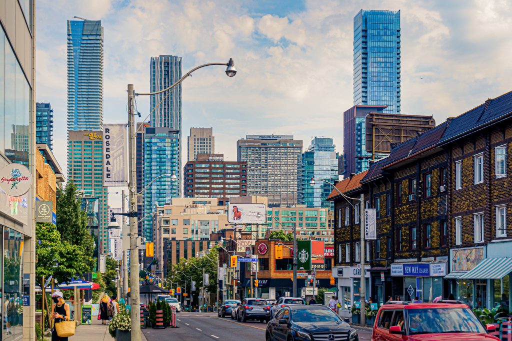
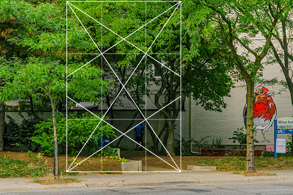
To finish the day, I just wanted a nice street view. When walking back home this section at Rosedale captured my eye because of the nice skyline, bright colours, and most of all the silly fact that I could line the “Rosedale” flag in the street pole between the gap created by the buildings in the vanishing point.